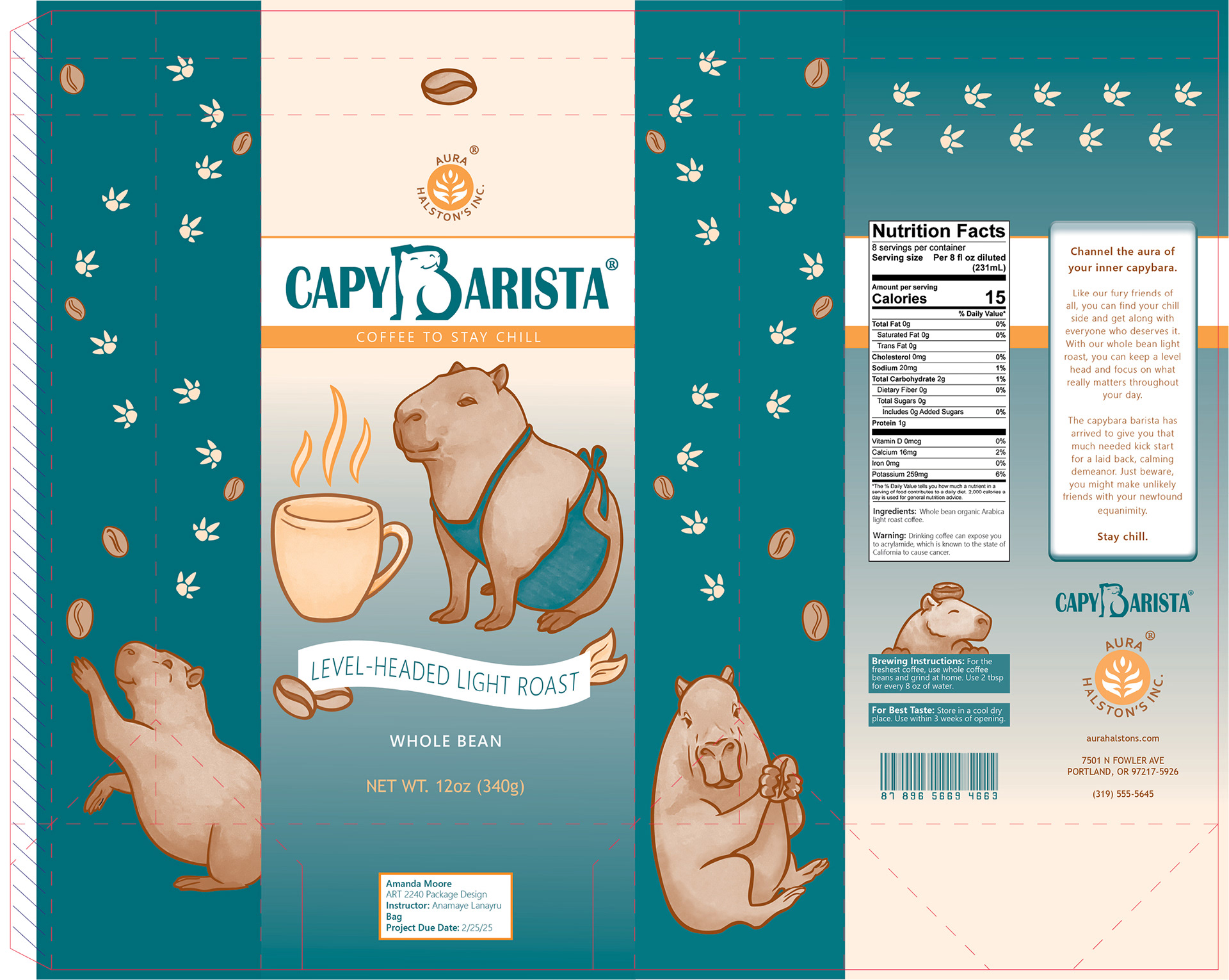
About the Project
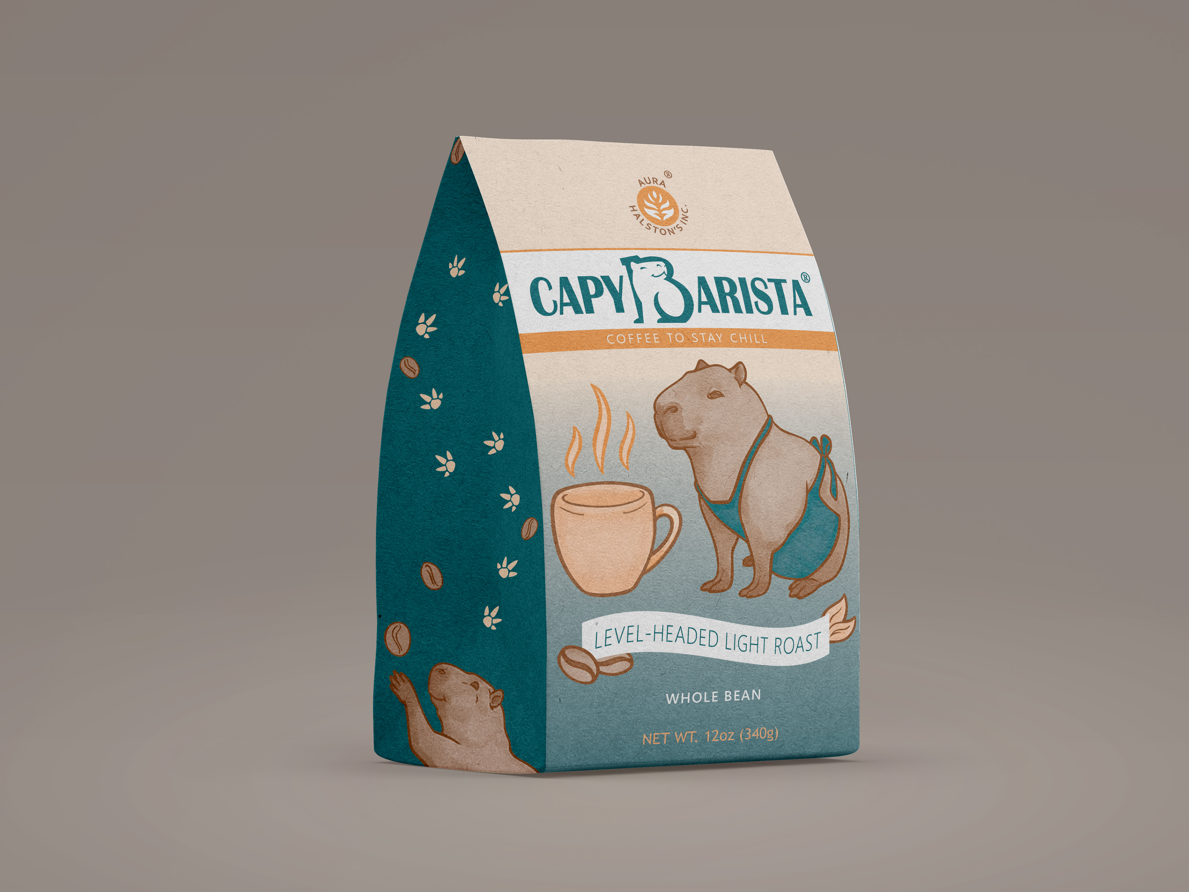
This was a project intended for a coffee product. With the parent company provided, the product name and design was of our own choosing. I opted for a play on words to intertwine the capybara, an animal known for its relaxed and friendly demeanor, with a coffee barista. The capybara has seen an increase in popularity in recent years and would align with the millennial and Gen Z target audiences. With this in mind, my brand design followed
the capybara’s association with cute and uplifting feelings.
the capybara’s association with cute and uplifting feelings.
Through the Process
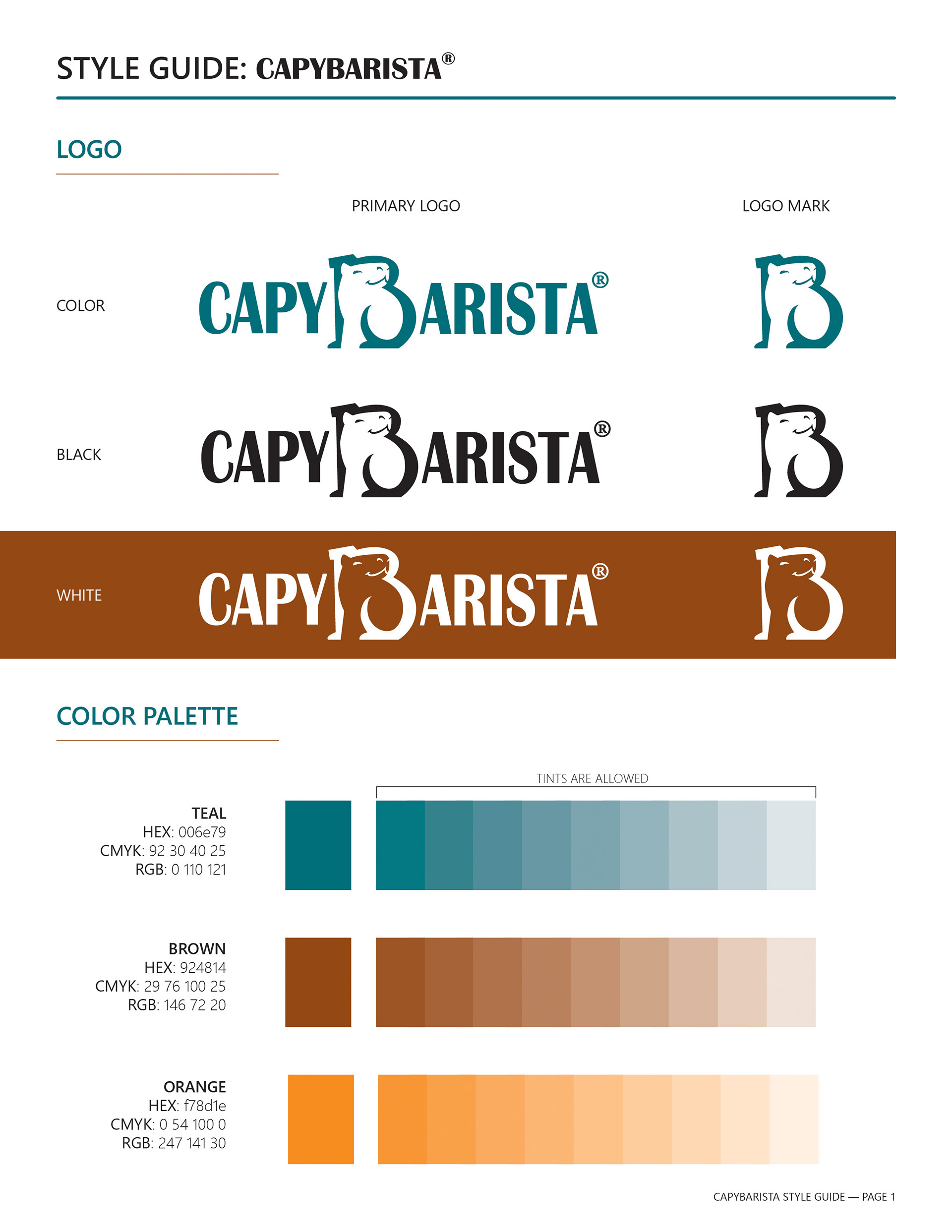
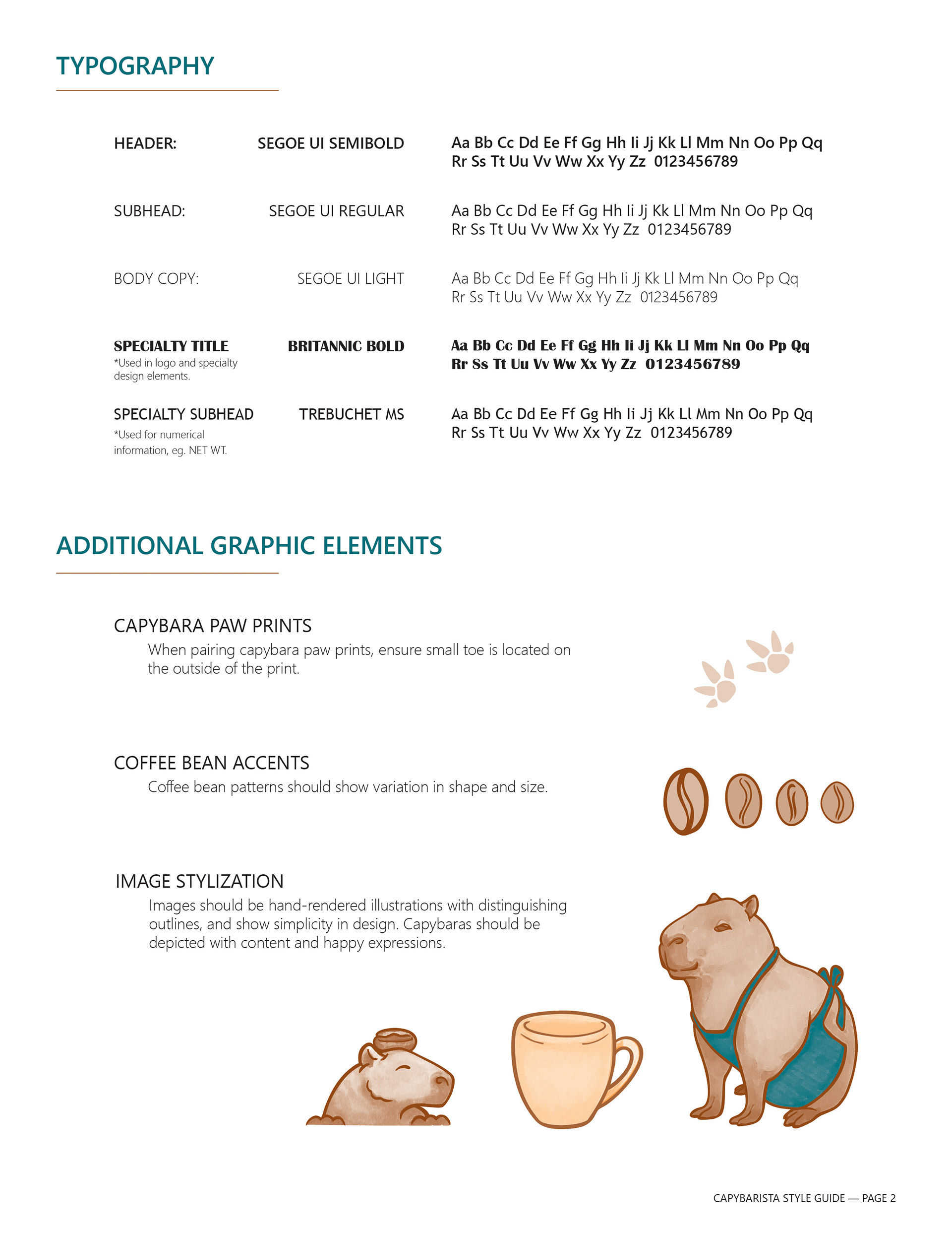
My logo design incorporated the letter B in barista, with the round shapes of the capybara body. The logomark can then be placed in the middle of the logotype in a cohesive combination. Design elements included illustrations of the animal with fittings of a coffee barista, along with coffee bean and paw print accents. The brand has a modern esthetic to it, in line of the capybara’s recent history. This project utilized three spot colors that are bright and youthful yet also reflect relaxation and calmness. A vibrant blue pairs with sunrise orange hues and the neutral brown
of capybara fur to create an eye-catching and pleasant look.
of capybara fur to create an eye-catching and pleasant look.