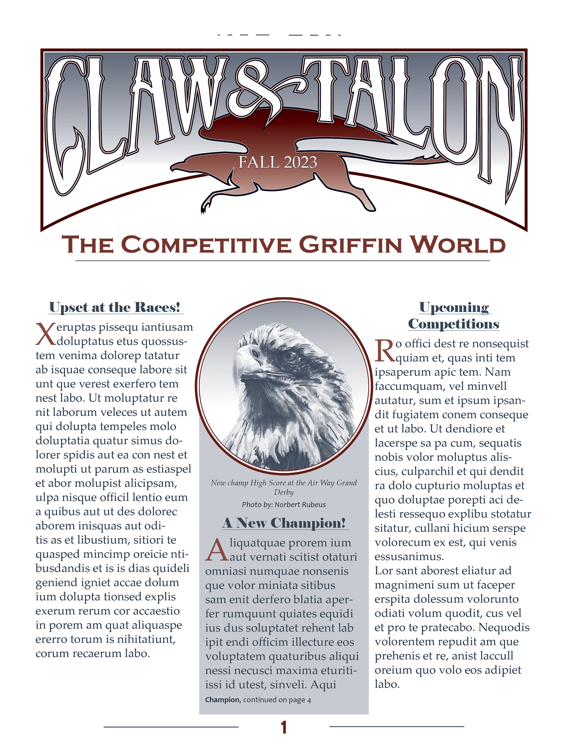
About the Project
The goal for this project was to create a four-page newsletter layout with standard issue elements, such as a masthead and headlines, drop caps, headers and footers, text wrapping, and photo captions. The item would use two spot colors throughout the entire design, and images were to be hand-drawn as photo indicators and tinted in the color palette.
Through the Process
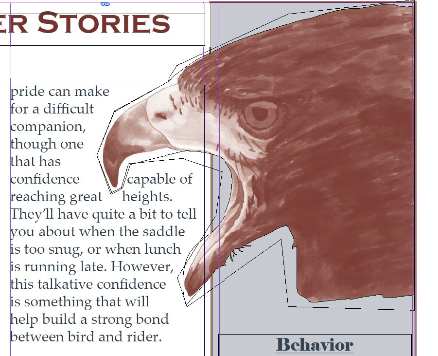
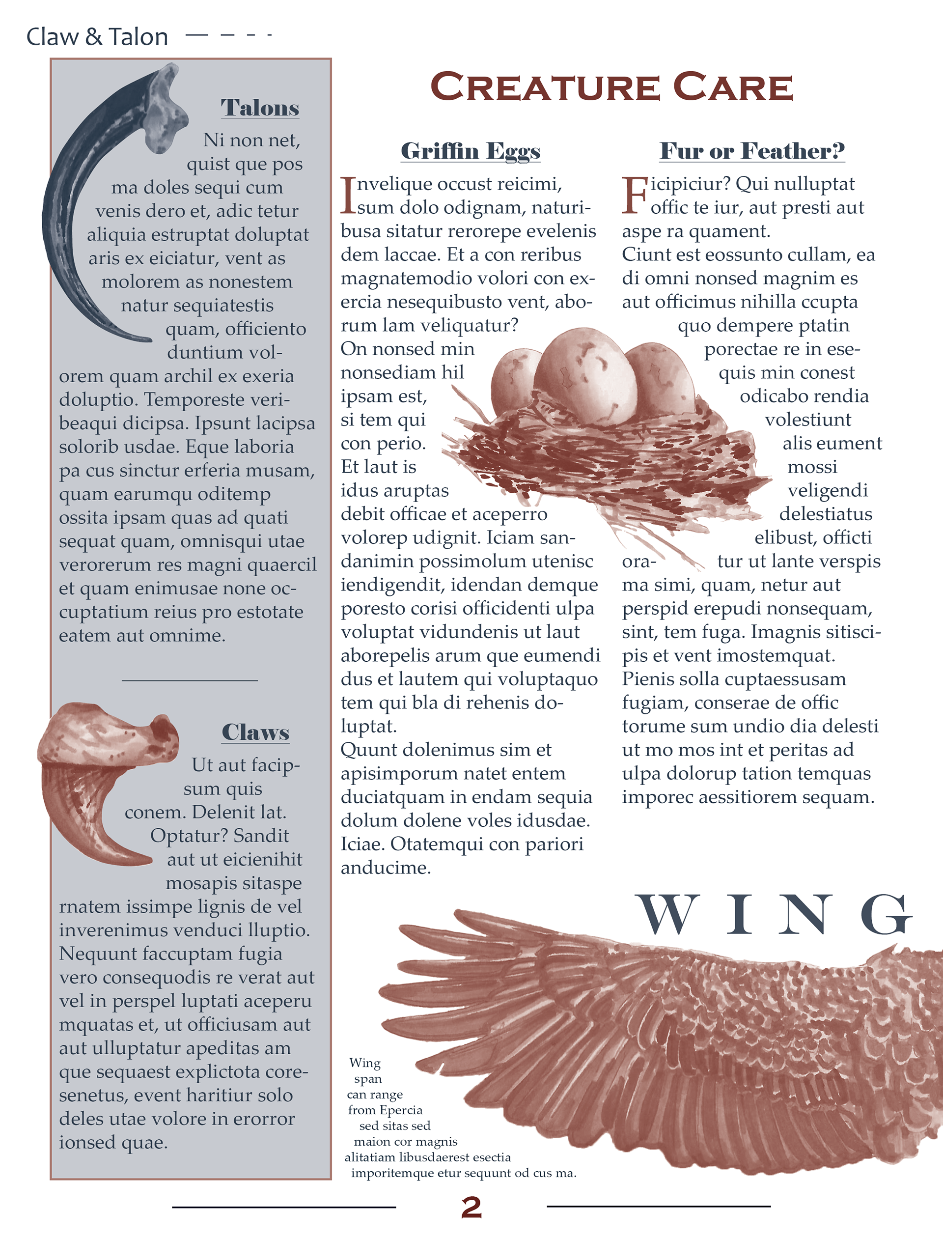
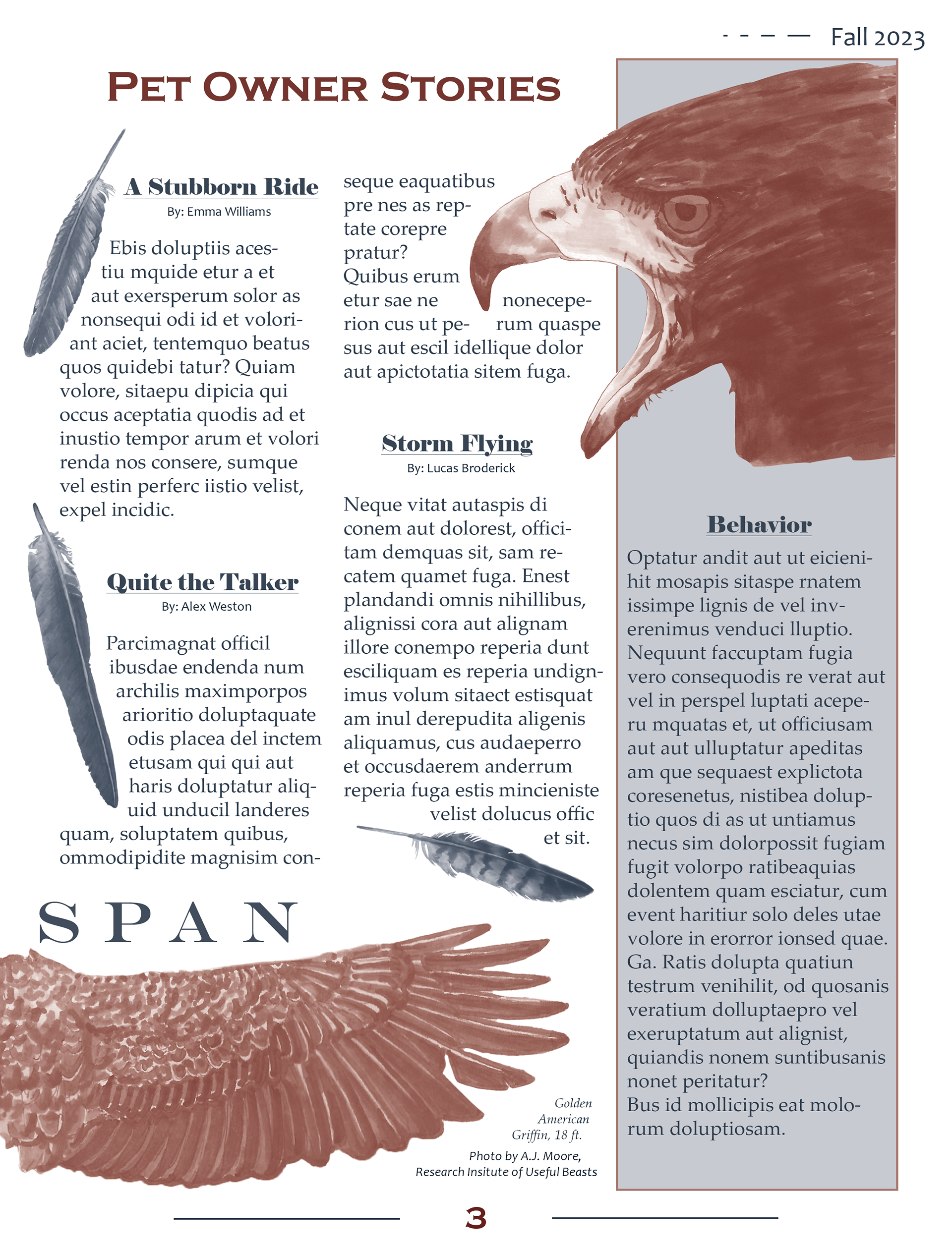
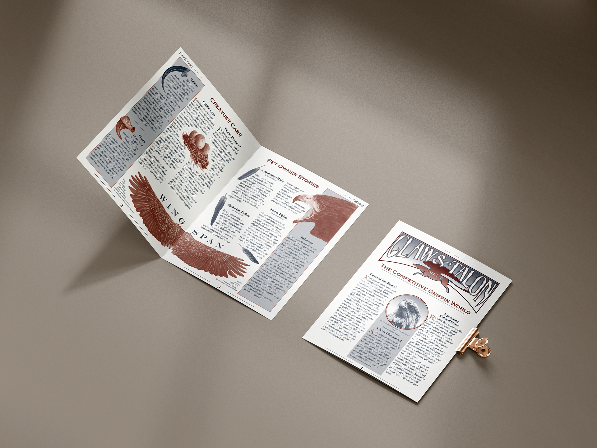
My design centered around griffin riding as a sport, and featured various attributes of the animal. To utilize the page spread, I placed open wings at its center, allowing them to flap with the movement of the page. Drawings that pertained to each column were positioned within and around the text, offering visual aid and interest. The masthead, as the main typographic element, used positive and negative space to show its namesake within the letters.
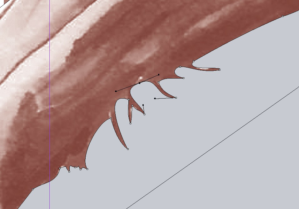
Image tinting proved a real challenge in this project, as transparancy could not be used. Any images over colored elements would need to be shaped by the frame to prevent its white background from interupting the layout. Great care was taken to ensure as much detail could be preserved in the final design.